Brief
The Next Revolution is a platform created to empower Gen Z disruptors through coaching, leadership tools, and thought-provoking content. Their team had a strong vision for their mission but needed a visual identity that could capture the spirit of modern activism while remaining optimistic, accessible, and trustworthy. The challenge was to build a brand expressive enough to resonate
with visually literate young audiences, yet credible enough for structured coaching and thought leadership.The identity also needed to expand into a more playful and experimental sub-brand for their podcast, Ten Revolutions.
Goal
with visually literate young audiences, yet credible enough for structured coaching and thought leadership.The identity also needed to expand into a more playful and experimental sub-brand for their podcast, Ten Revolutions.
Goal
The ambition was to create a forward-looking identity that communicates clarity, energy, and momentum. The visual system needed to feel bold and future-facing, but grounded enough to be used across coaching materials, editorial content, and digital platforms. At the same time, the podcast sub-brand had to push expression further, introducing a more dynamic and kinetic language that suits audio-first storytelling while remaining connected to the parent identity.
Journey
Journey
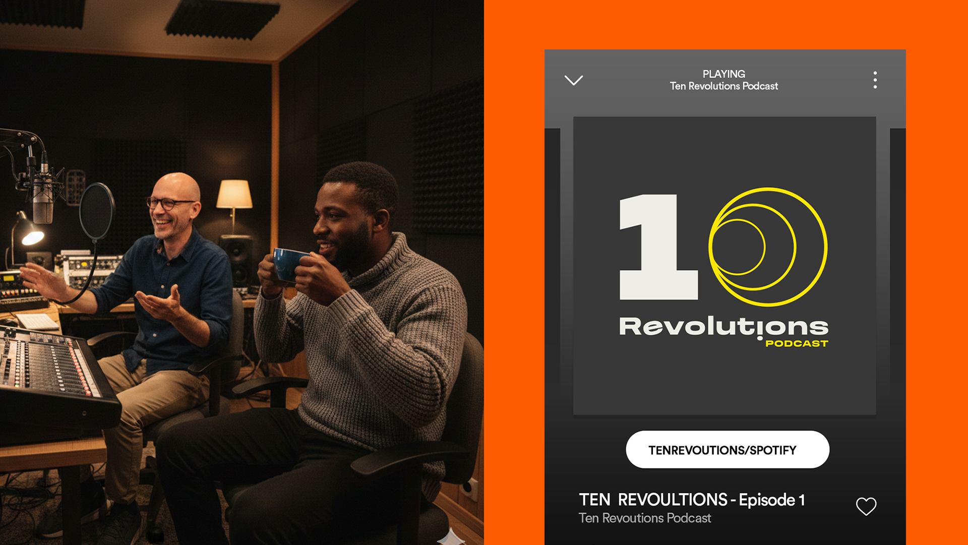
The design process began with an exploration of visual activism - movements defined by strong typography, clarity of message, and graphic immediacy. This led to an identity built on confident type, structured layouts, and a signature yellow chosen for its energy and sense of progress. The visual language balances expression and order: bold gestures, directional framing, and stretched or expanded type create a feeling of momentum, while the underlying grid ensures consistency and professionalism.
Ten Revolutions, the podcast sub-brand, extends this foundation in a more playful direction. Dynamic numerals, ripple-like motifs, and vibrant accent colours introduce movement and rhythm, evoking the idea of ideas expanding outward. This language feels energetic and audio-responsive, yet still grounded in the core brand principles.
The final identity is modern, optimistic, and unmistakably geared toward a generation demanding change. It is bold enough to catch attention, clear enough to support structured communication, and flexible enough to translate seamlessly across digital, editorial, and social formats - with a sub-brand that brings an extra layer of expression and momentum.