Brief
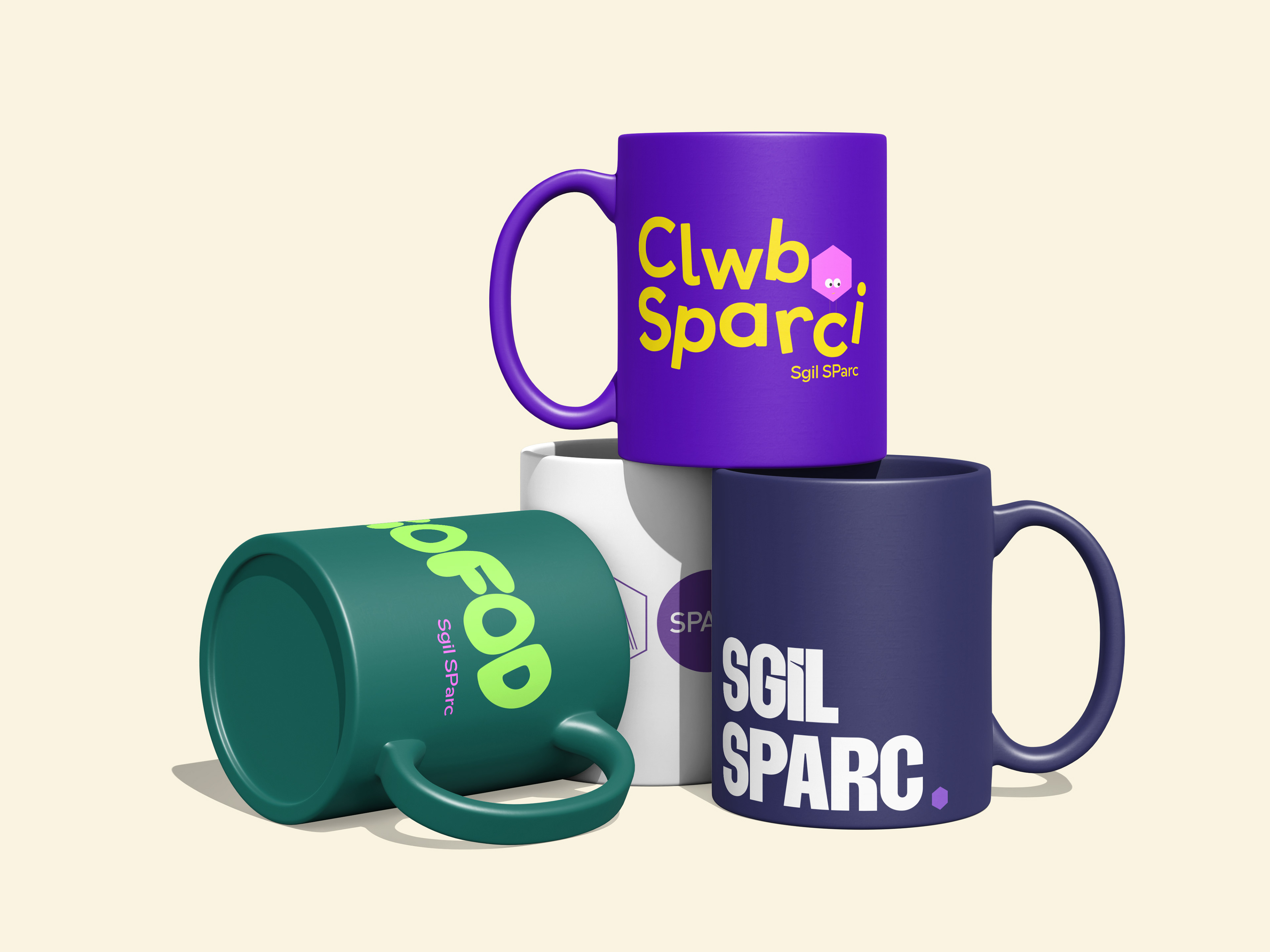
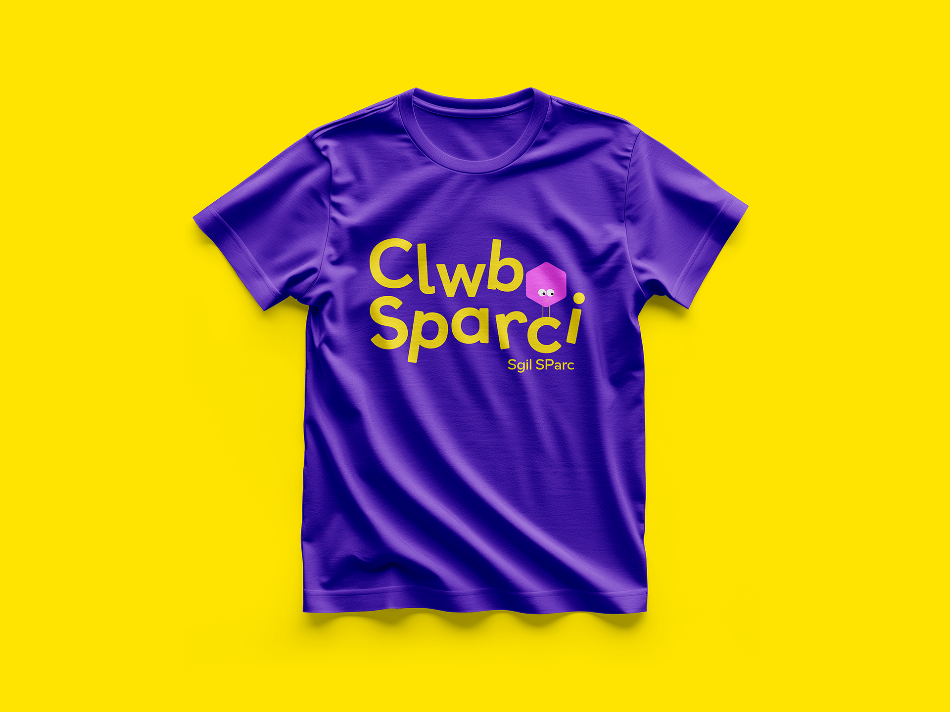
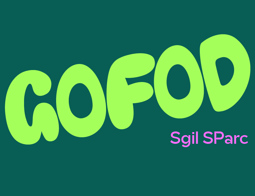
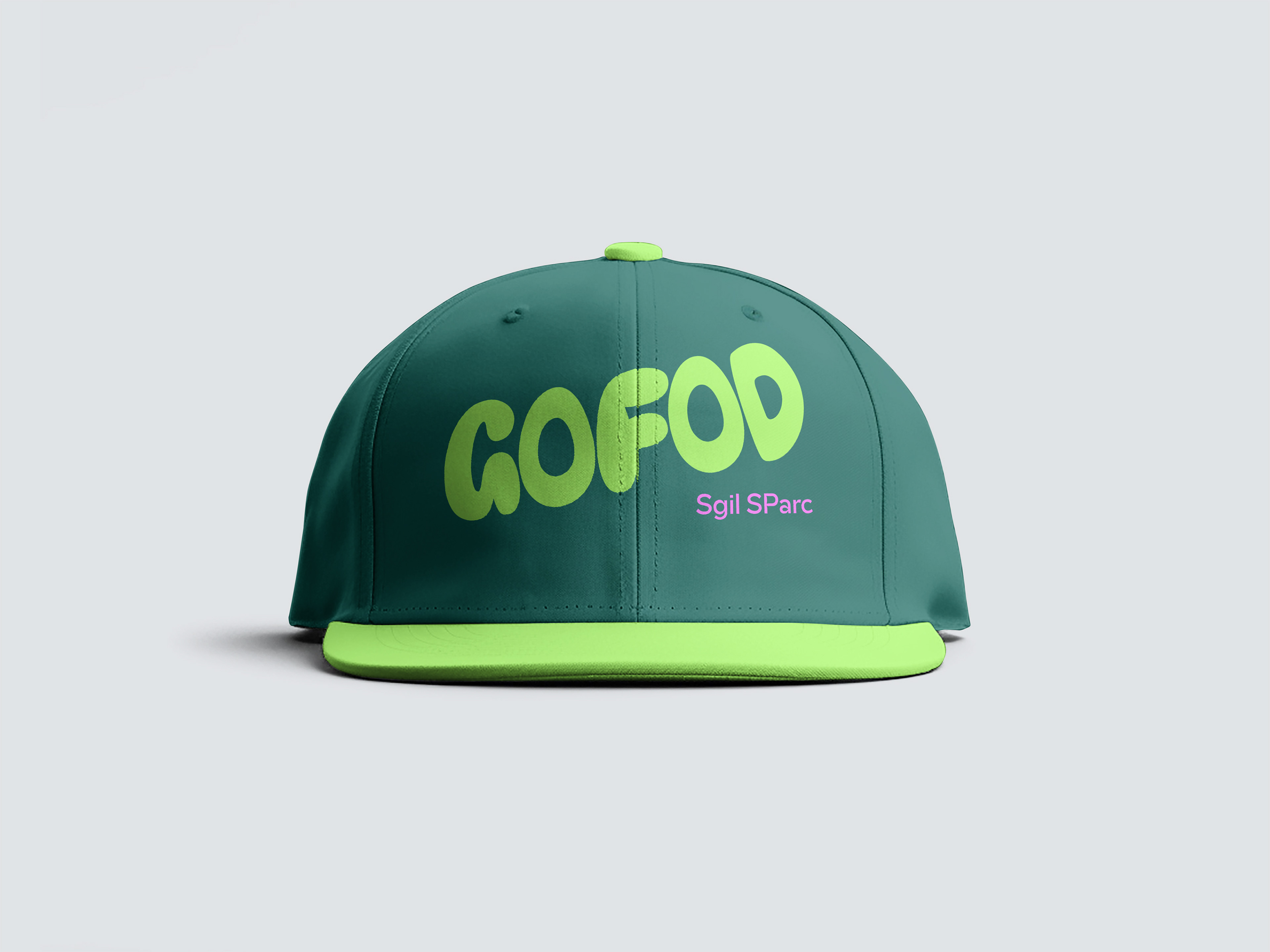
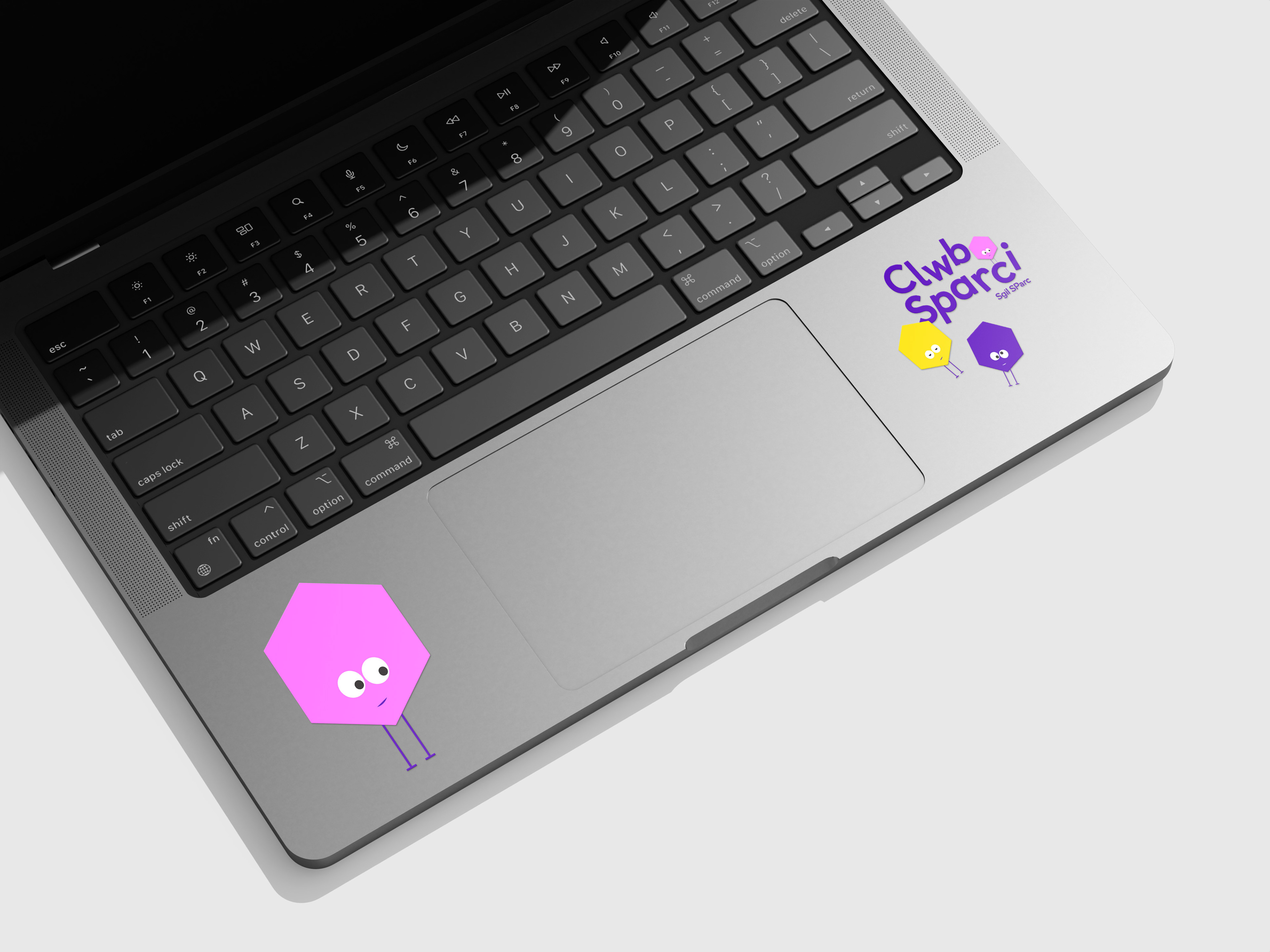
Sgil Sparc is a community and outreach programme in North Wales supporting young people across different age groups. They needed a brand identity system that could operate on multiple levels: an overarching umbrella brand that feels credible to teachers and older students, and sub-brands - Clwb Sparci (under 11s) and Gofod (12–17) - that feel age-appropriate and engaging.
Goal
To build a cohesive visual system that balances academic trust with youthful inspiration. The identity needed to be vibrant enough for children and teenagers, structured enough for educators, and flexible enough to grow with the organisation.
Process
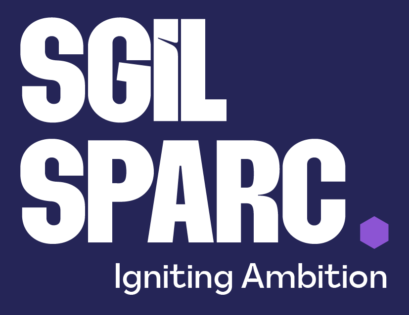
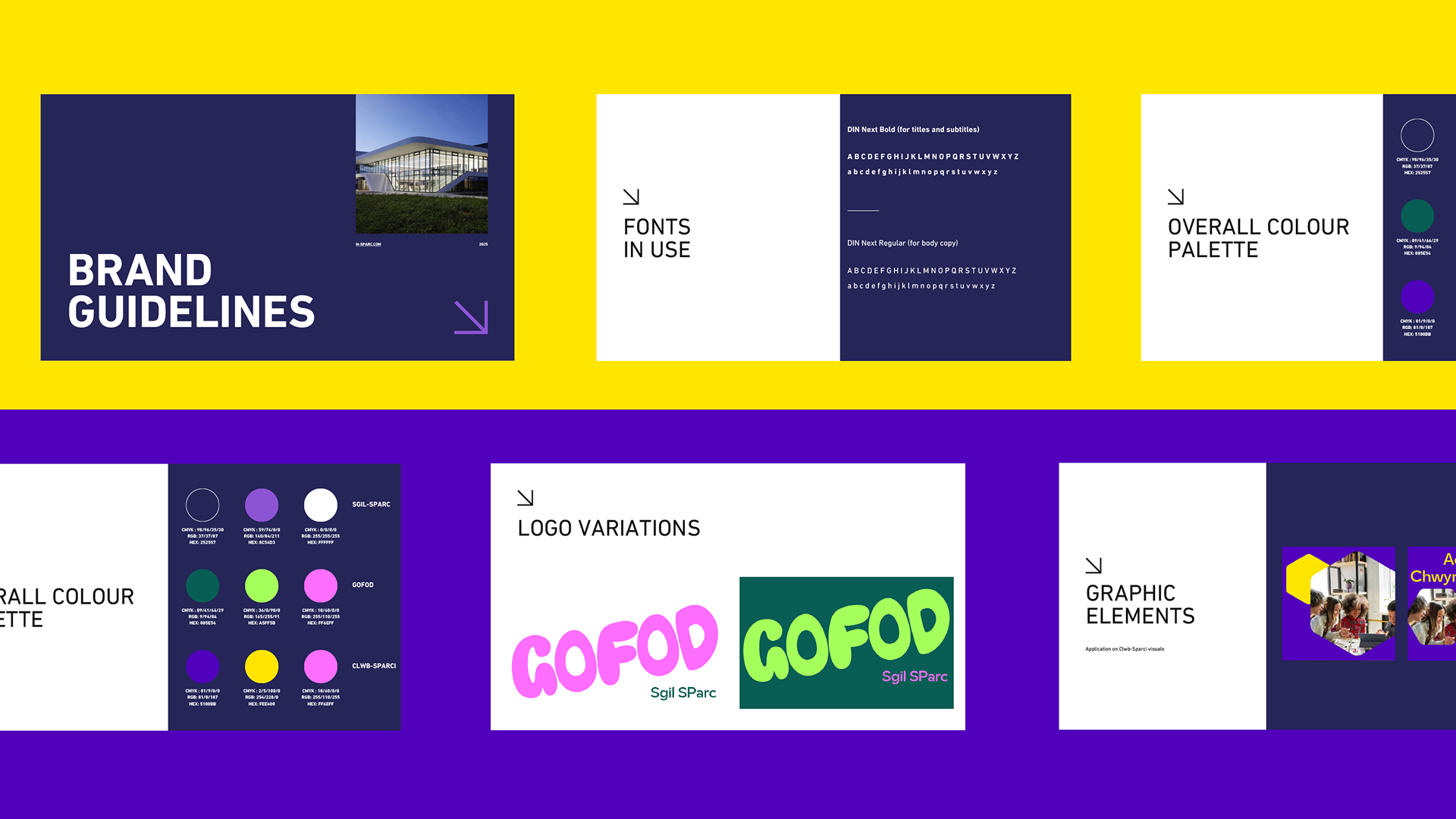
Working with Tropic.Studio, I developed a typographic system that uses strong contrasts to express the duality of the programme: SGIL conveys structure and learning, while SPARC introduces dynamism and energy.
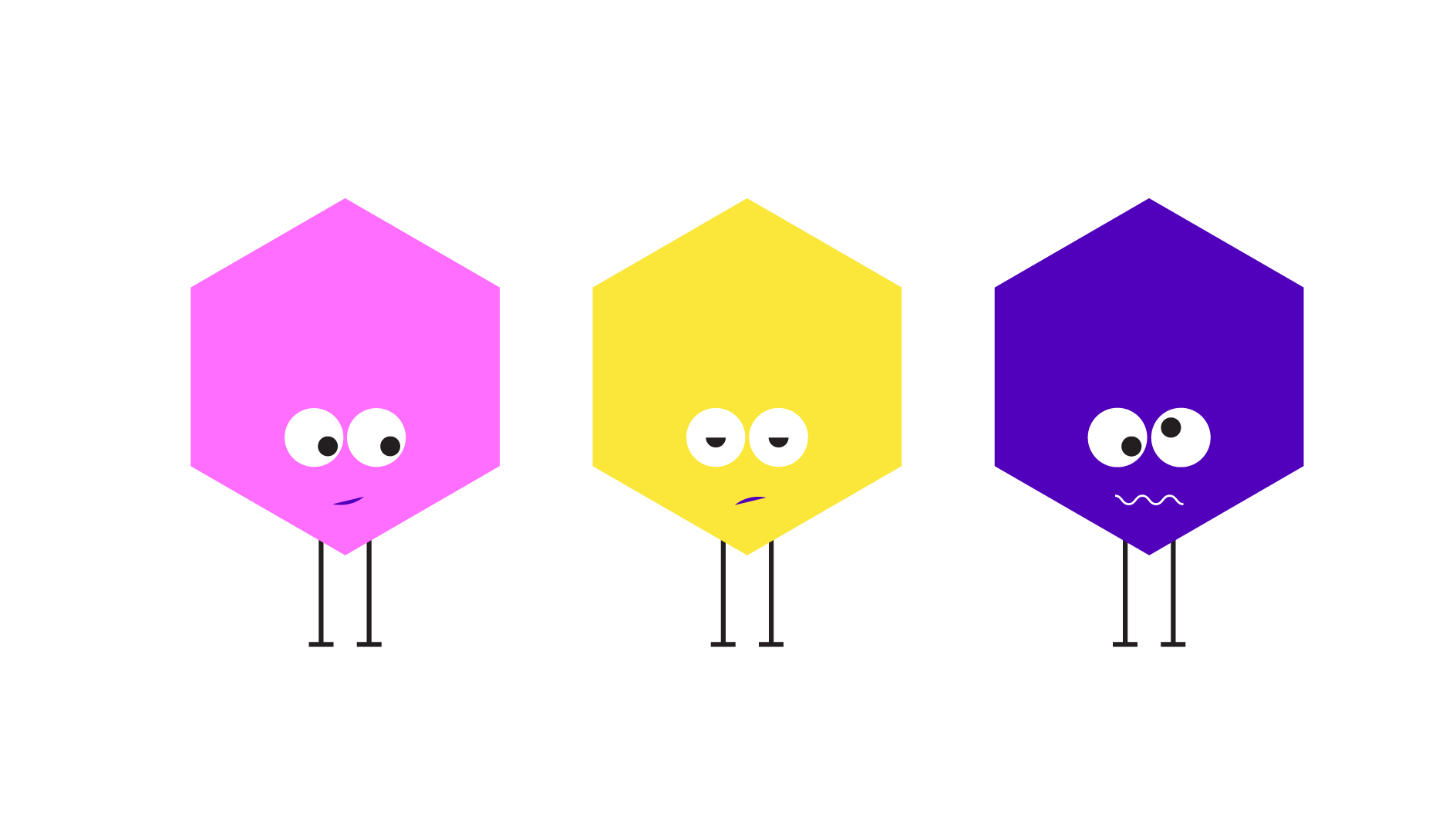
A rich purple was chosen as the core brand colour, symbolising ambition, quality, and aspiration. A geometric hexagon became the foundation of the system - a modular element that can be recoloured, reshaped, and extended across sub-brands.
A rich purple was chosen as the core brand colour, symbolising ambition, quality, and aspiration. A geometric hexagon became the foundation of the system - a modular element that can be recoloured, reshaped, and extended across sub-brands.
Each sub-brand uses adapted versions of this system, ensuring individuality while maintaining cohesion. The final identity is bold, scalable, and inclusive - able to speak meaningfully to children, teens, educators, and the wider community.