Brief
Develop full visual identity for Fresia Gastronomia, a brand rooted in family heritage. Named after the founder’s mother and inspired by the memory of a family-owned mill, the project called for an identity that could carry personal history without becoming sentimental or decorative.
Goal
The ambition was to distil a deeply personal story into something culturally recognisable yet restrained - avoiding the overused tropes of “Italianicity” in favour of a more honest, grounded expression. The identity needed to feel warm and familiar, but never nostalgic for its own sake; distinctive, but not loud.
Process
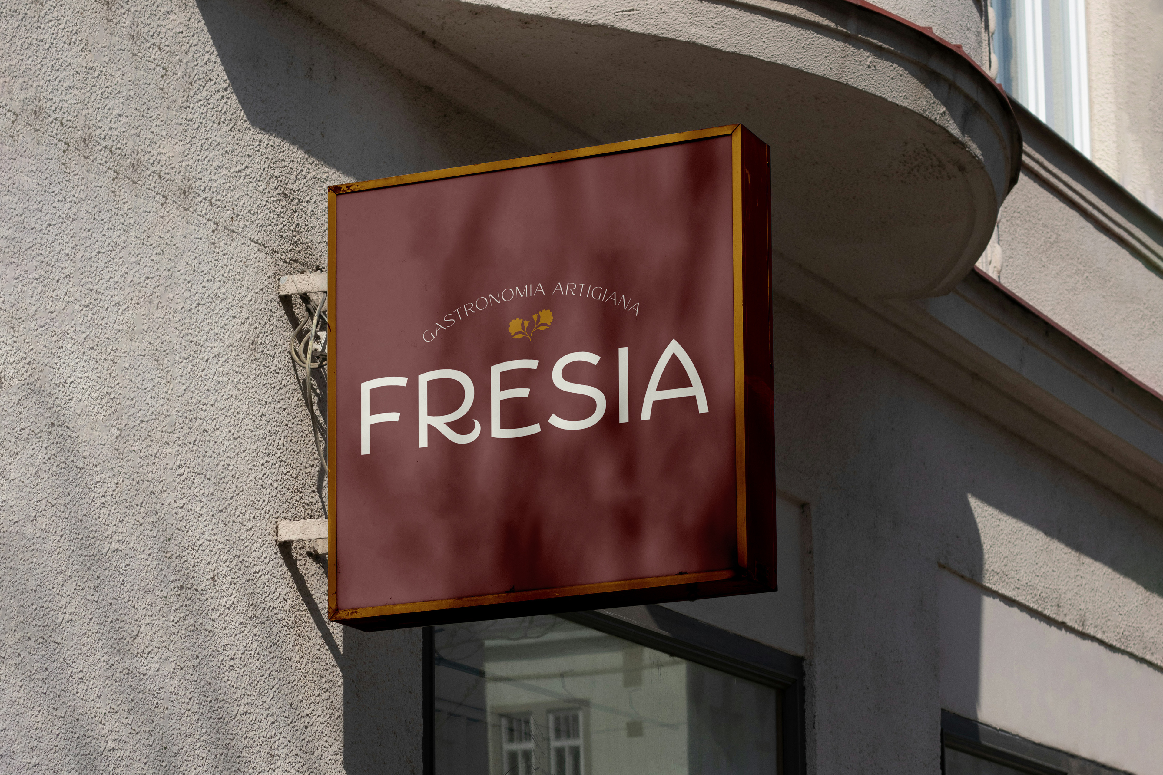
The starting point was vernacular Italian design - particularly historic shop signage - not as a stylistic reference to replicate, but as a framework for tone and attitude.
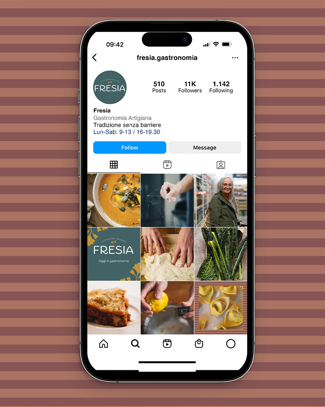
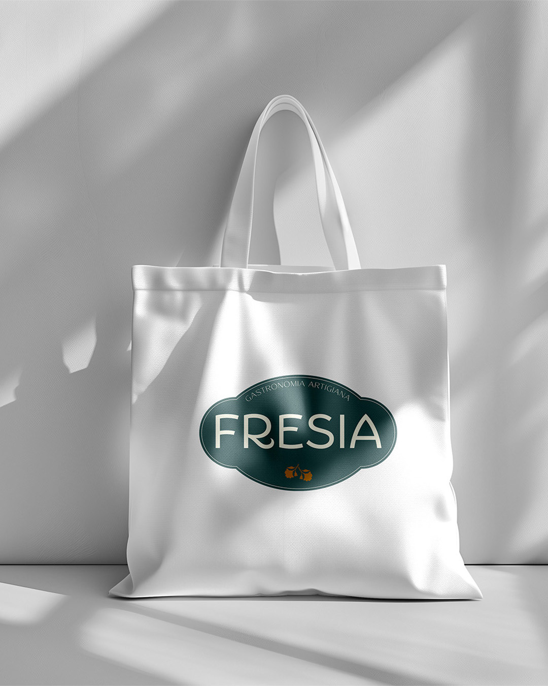
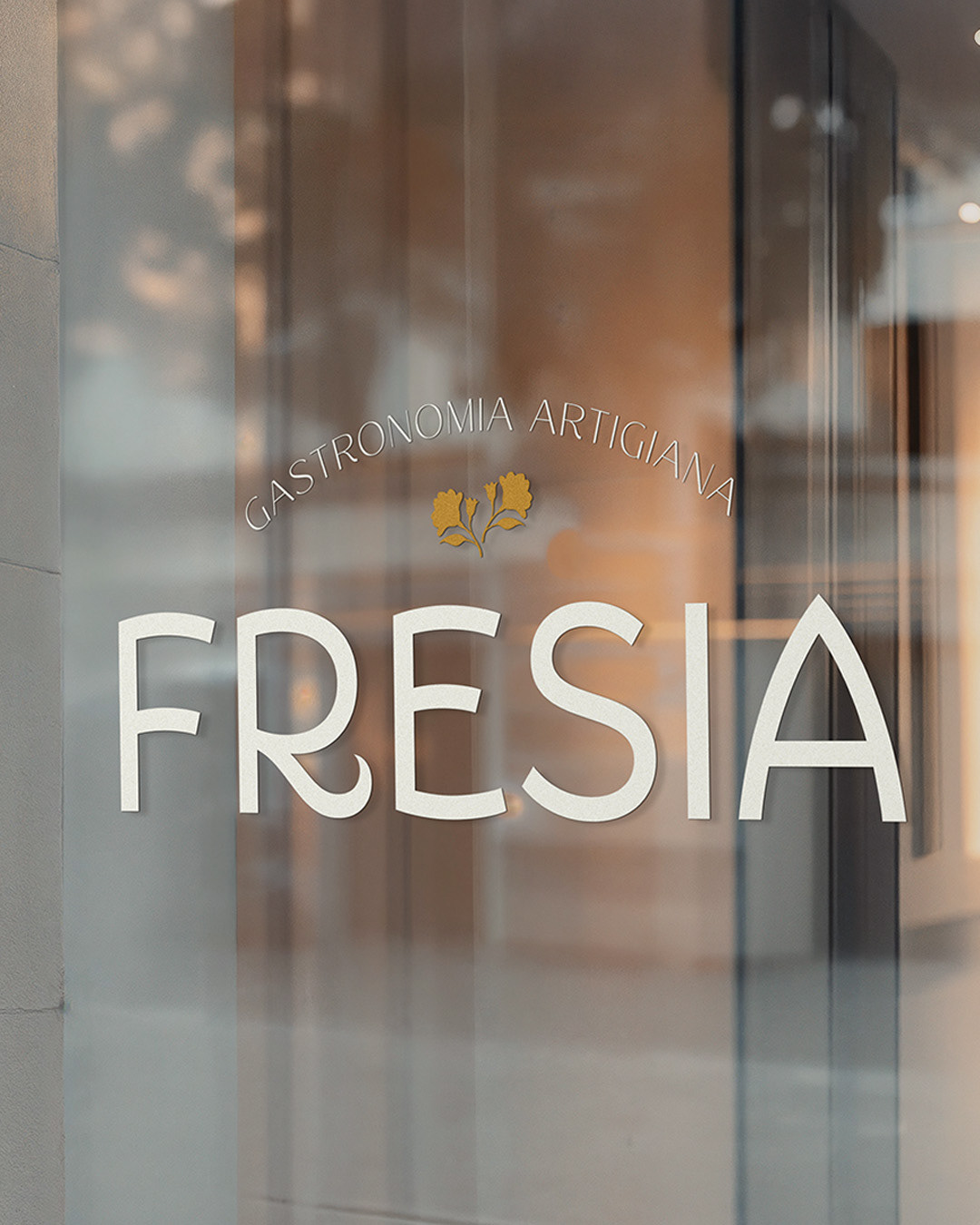
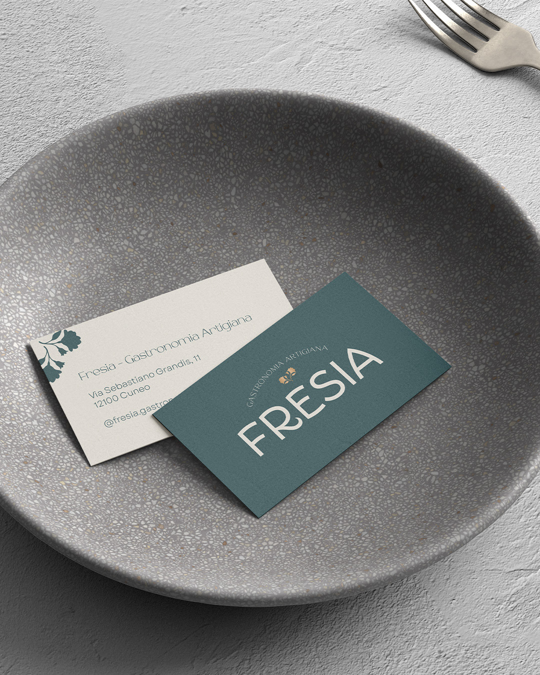
Typography became the central device. The logotype is set in Portofino typeface, chosen for its balance of elegance and informality: expressive enough to carry character, but structured enough to remain timeless. Its use also acts as a quiet nod to Louise Fili, whose work continues to define a certain idea of Italian typographic culture.
The system intentionally resists embellishment. No illustrative layer, no unnecessary complexity — just careful control of type, spacing and proportion. The result is an identity that relies on confidence rather than decoration, allowing the story to sit beneath the surface rather than be spelled out.
Outcome
The final identity feels assured and unforced - rooted in heritage, but not constrained by it. It positions Fresia as a brand that belongs as much to the present as it does to its past, with a visual language that is flexible, recognisable and built to last.
b