Brief
OTO is a luxury wellbeing brand grounded in Japanese minimalism, known for combining modern wellness with traditional Eastern philosophies. For their Christmas season, they wanted a collection that felt premium and gift-worthy but still deeply aligned with their serene, meditative brand world.
The brief included a 12-day advent calendar, a suite of coordinated gift sets, and the supporting visual direction for campaign assets. The challenge was to introduce festive spirit and seasonality without compromising the quiet elegance and restraint that define OTO’s identity.
The brief included a 12-day advent calendar, a suite of coordinated gift sets, and the supporting visual direction for campaign assets. The challenge was to introduce festive spirit and seasonality without compromising the quiet elegance and restraint that define OTO’s identity.
Goal
The aim was to design a festive experience that felt luxurious, thoughtful, and calming - a counterpoint to the typical noise of holiday design. Every detail of the range needed to communicate a sense of ceremony and care, from the tactile materials to the unboxing sequence.
The goal was to create packaging that felt like a ritual: elevated enough to stand out as a premium gift, but minimal and refined enough to stay true to OTO’s Japanese-inspired design philosophy.
The goal was to create packaging that felt like a ritual: elevated enough to stand out as a premium gift, but minimal and refined enough to stay true to OTO’s Japanese-inspired design philosophy.
Journey
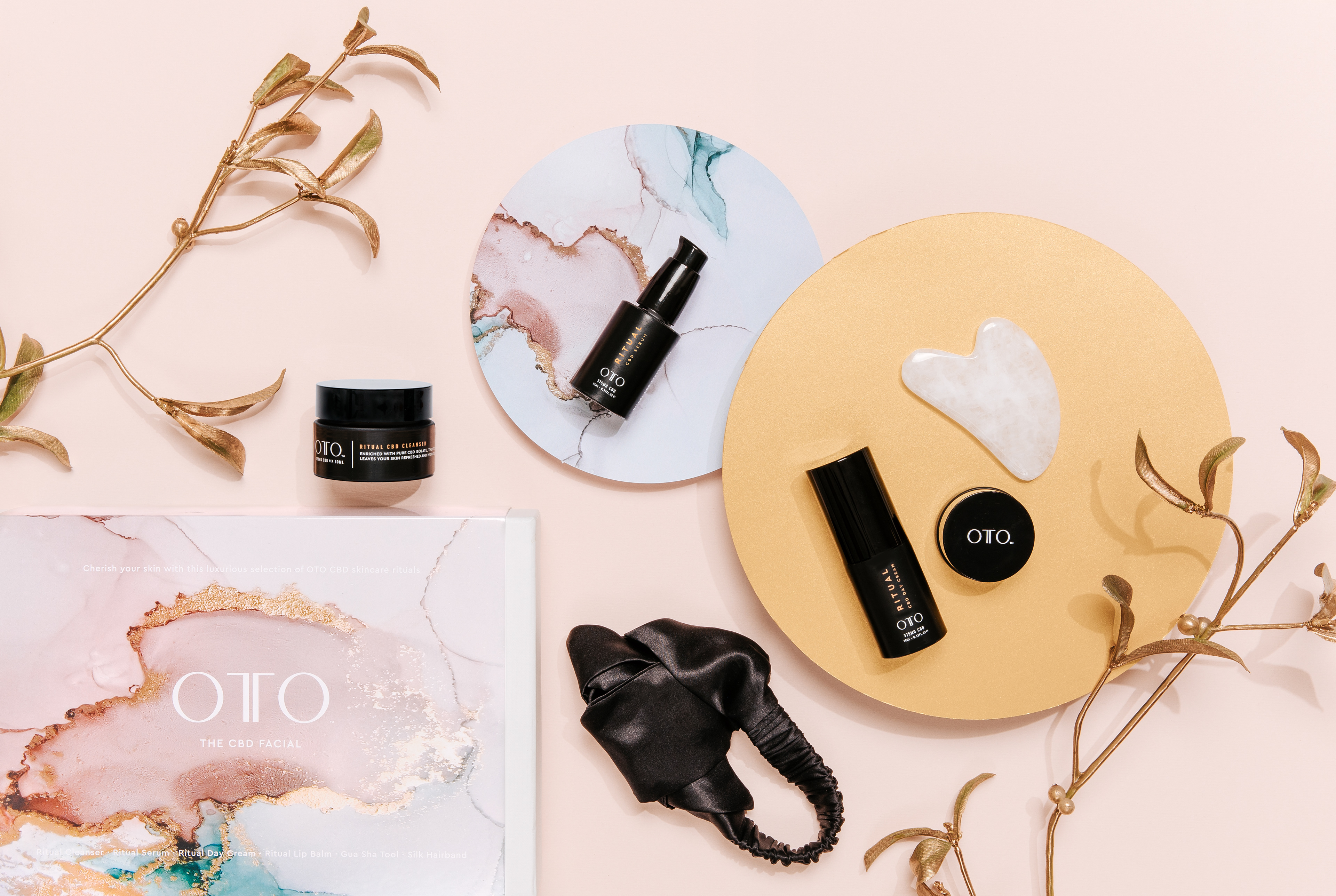
The creative direction began with the idea of stillness within celebration - a collection that offers a moment of pause during a busy season. To bring this vision to life, I collaborated closely with artist Lindsay Oliphant, commissioning a series of bespoke ink artworks inspired by traditional Japanese ink painting. These pieces captured movement, texture, and natural forms with an understated elegance that resonated with the brand’s values.
The illustrations became the backbone of the visual language, informing everything from the composition of the packaging to the rhythm of negative space. I designed the advent calendar and gift sets using textured papers, subtle metallic touches, and precise structural details that made each opening feel intentional and ceremonial. The forms were designed to feel almost architectural - clean, balanced, and quietly luxurious.
To ensure consistency across every touchpoint, I also directed the photoshoot for the collection. The images focused on the tactile qualities of the materials, the interplay of light and shadow, and the sense of calm inherent in the designs. This visual approach created a cohesive tone across PR assets, e-commerce imagery, and campaign communications.
The final Christmas range blends the warmth of the season with the restraint of Japanese aesthetics. It feels festive without excess, luxurious without flashiness - a calm, beautifully crafted collection that elevates the ritual of gifting and reflects the essence of OTO.

Calendar
The 12-days advent calendar for OTO is a meticulously designed piece that encapsulates the brand’s ethos of luxury and mindfulness.
The artwork draws from traditional Japanese aesthetics, incorporating elements of serenity, nature, and abstract beauty. Opening an OTO product is designed to be a serene, almost meditative experience. Each element, from the outer box to the inner packaging, is designed to evoke a sense
of calm and anticipation.

Christmas Range
OTO’s luxury and minimalism shine through the packaging range, featuring clean lines, high-quality materials, and subtle elegance.
Textured paper, metallic accents, and embossed details enhance its premium feel. While rooted in Japanese aesthetics, festive gold touches and motifs add a celebratory yet sophisticated touch.